KISSmetrics: 5 Steps to Recovering from Low Landing Page Conversions
KISSmetrics: 5 Steps to Recovering from Low Landing Page Conversions |
| 5 Steps to Recovering from Low Landing Page Conversions Posted: 29 Jun 2016 10:28 AM PDT Landing pages are intended to be simple and straightforward – a single page designed to get a specific audience to take an action.
You'd think that creating a page for such simple tasks would be easy, especially when you consider the wealth of tools at our disposal for building out landing pages. And, in fact, the act of producing landing pages is actually not complicated – at least, until you factor in the human component of your audience. People, the ones you want to get to take a specific action, muck up the entire process and make landing pages much more difficult. There's no specific way to design or configure a landing page to ensure it's going to perform a certain way or deliver favorable conversions. All you have is your research and whatever knowledge you may have picked up about copy and landing page best practices, so you go on intuition. You're not alone in that. Over 60% of marketers optimize sites based on intuition alone. Then the testing starts. And despite everything you feel you've done correctly, you go through what many others experience: lackluster conversion rates. There are a lot of changes and tweaks you can make, but don't approach your landing page like a master control panel where you start pulling levers and pushing buttons blindly. There are 5 key areas where you can start making small challenges to positively influence your conversion rates. 1. Trust SignalsSimply put, if you don't have trust, then you don't have sales. You may have been funneling traffic to your landing pages as a result of lead nurturing, but chances are you've got some fresh landing page traffic made up of people who have no idea who you are. Even if you've been nurturing your leads via email and building a relationship, you still need strong trust signals to boost the confidence of your audience and help tip them over into a conversion.  Social proofSocial proof tells your audience that you can be trusted because other people have trusted you and made an investment of time and/or money. If you've got the attention and business of these other people, then you must be credible to some degree. Some of the most common ways of adding social proof to a landing page include highlighting social shares, number of purchases, subscriber counts, or social followers. Supplier/manufacturer affiliationIf you partner with any brand, be it a major organization or an influencer, getting their name or logo on your landing page creates an affiliation in the mind of the audience. The audience will perceive you as more trustworthy and credible because you're working with X brand, which must mean that X brand trusts you. You'll see this a lot with brand mentions that include "As seen on" logo placements. Third-party certificationsThey may not seem like much, but certifications can put a lot of people at ease, especially if you're asking them to give you money or personal information. Using third-party certifications such as the Better Business Bureau and VeriSign create a perception of authority around your landing page and brand. TestimonialsTestimonials are another form of social proof, and are one of the strongest trust symbols. According to Nielsen, 83% of consumers trust recommendations from people they know, and 66% trust consumer opinions posted online. If you can, share the full details from customers, including their name and city if they're comfortable with it. Because it's easy to fake testimonials (and many online consumers know it) it pays to be as transparent as possible. 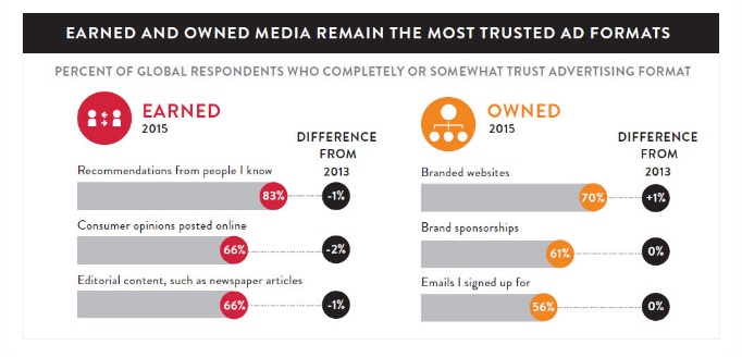 2. Fix Your Call to Action and Make it ObviousRemember what I said above: your landing page has a single goal. The only way you're going to get your audience to take action is if you make that goal 100% clear to the people landing on your page. If you don't have your call to action where it's visible, above the fold, then it's virtually impossible to direct people to take action. The reason for this is because most people spend less than 15 seconds on any given web page, which means most won't even bother scrolling. They'll glance, their brain will decide whether you're relevant or not, and they'll bounce. If you hide your call to action below the fold, bury it in clutter, or don't make it stand out, then you'll lose a considerable amount of conversions. 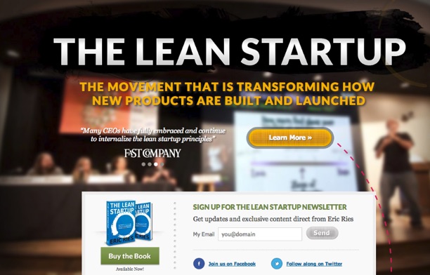 Eric Ries' Lean Startup keeps the call to action above the fold and clearly visible. Everything your audience needs to make a decision should be above the fold, but don't necessarily try to put all of your content above the fold. Likewise, it takes more than the placement of the call to action to make it effective. It also needs to be compelling. Use power wordsAvoid using corporate babble and industry jargon. Stick with practical language and power words that are proven to compel people to take action. Use active languageRemember that your call to action is telling your audience to do something. Use verbs that inspire that action, such as "Join," "Subscribe," "Download," etc. Make it stand outYou want your call to action to stand out from everything else on the page, but you also want it to be consistent with the design and theme. Tim Ferriss uses a great CTA design that clearly shows his audience where to begin. 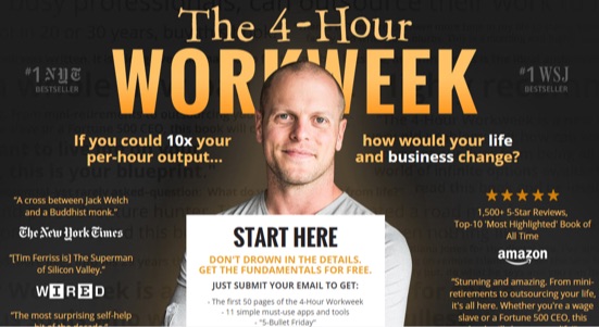 I also want to point out the trust signals he uses on his landing page. Use brevityThe best CTAs say the most in the fewest words, so limit them to around 90-150 characters. That's about 5-7 words. If your call to action is too long, then you lose the hook, and if it's too short, it may not clearly convey what step visitors should take (or why.) Make it personalAvoid using broad calls to action like "Start today." Instead, personalize it to the user so it reads more like "Start your trial today." 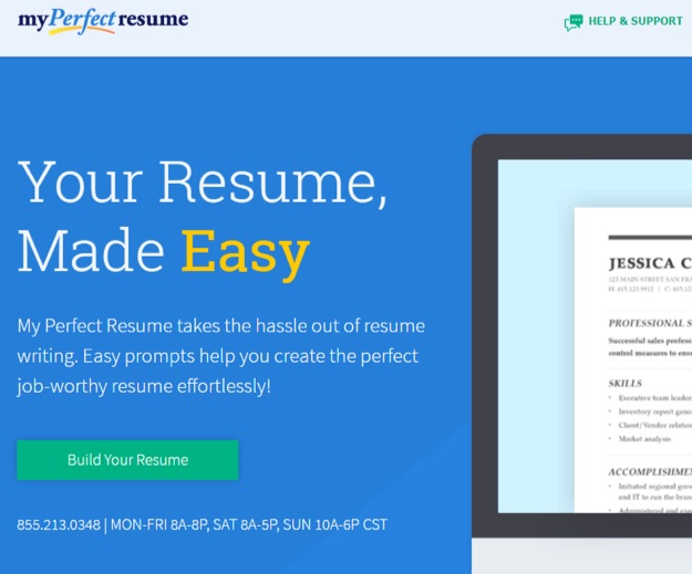 3. Remove the Ability to go ElsewhereClear navigation and links are great to use in your content marketing and on your website to help you expand on concepts and help the audience get to a destination, but they don't belong on your landing page. Your landing page is the destination. You never want to give visitors the ability to click out of this endpoint in your funnel. Remove the navigation from your landing page, and avoid adding links to your content at all costs. 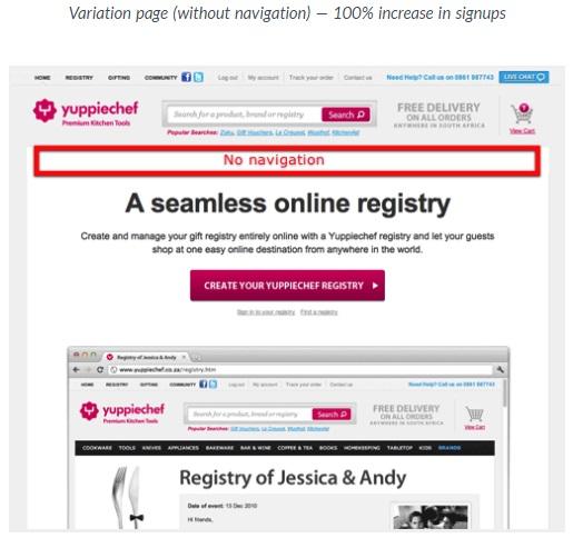 I also recommend adding in an exit pop-up that will appear based on user behavior, such as if the user moves their mouse toward the top of the browser. This pop-up should encourage them to stay and focus their attention on the main call to action. 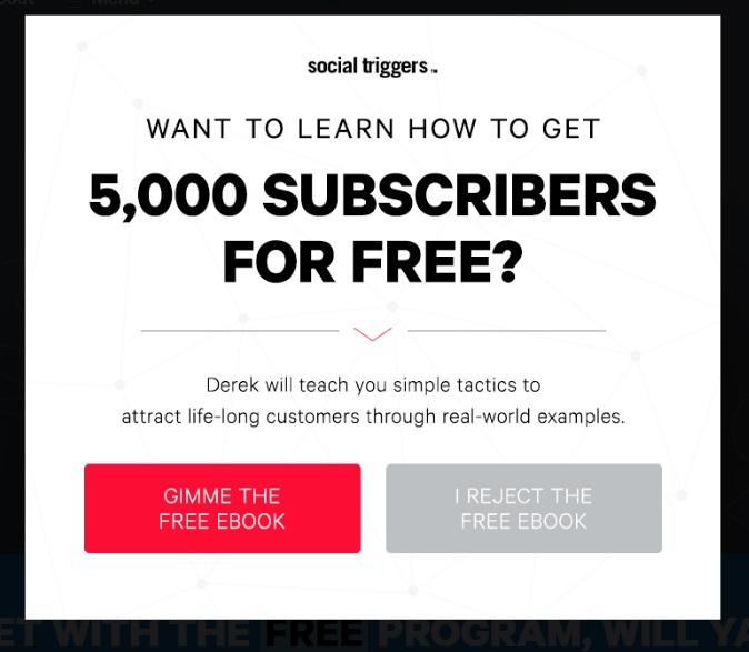 4. Add Visual EngagementIf you're getting great traffic but the conversions are low, try to incorporate visual elements as a way to improve engagement and keep the attention of your audience. People who view video are almost 2x as likely to make a purchase, and, according to another study, the addition of video to a landing page can increase conversions by as much as 80%. 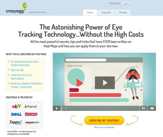 Even if you can't create high-quality video content, you can still use relevant images to seal the deal with your audience. Include high-definition product photos, illustrations, or quality screenshots for digital services that show some behind-the-scenes product/service use. 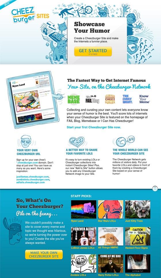 Think like a shopper – people often want to pick up, look at, and handle a product before they purchase it. Visuals make the audience feel like they're doing just that. This is why e-commerce sites rely on detailed and numerous product photos to help sell their goods. 5. Improve the CopyYour copy consists of every written element on your page, especially the headlines. It should be compelling, free of errors, and written in a way that makes an emotional and psychological connection with your target audience. It also needs to be presented in a way that's easily scannable, with the most critical points standing out with formatting and design elements like bullets and callouts. 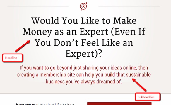 I can't tell you what you should say – that's going to be based entirely on your audience and what they need to hear, so that's where your own research comes into play. Test Everything You DoEvery change you make is going to have some kind of an impact on your conversions. Hopefully you'll see a lift in conversions, but it's possible for a change to cause them to drop. That's why testing is so important. There are two ways to test the work you're doing. A/B testing lets you pit two elements against each other so you can test one or two updates, such as a headline or call to action. Once you have a winner, you can test again or move on to another element. Multivariate testing lets you evaluate a larger number of changes across your page at the same time, helping you find the best combination. It's more complex to do, and many marketers prefer A/B testing over this method, but it can get you through testing a lot of changes more quickly. If you're getting low conversion rates, you don't need to scrub it and start over. Make small, strategic changes to your copy and calls to action, and monitor your performance using the recommendations above. With the right approach, you should begin seeing substantial lifts in your conversion rates. What kind of changes tend to bring you the best results with your landing pages? Share your success with me in the comments. About the Author: Aaron Agius is an experienced search, content and social marketer. He has worked with some of the world's largest and most recognized brands to build their online presence. See more from Aaron at Louder Online, their Blog, Facebook, Twitter, Google+ and LinkedIn. |
| You are subscribed to email updates from The Kissmetrics Marketing Blog. To stop receiving these emails, you may unsubscribe now. | Email delivery powered by Google |
| Google Inc., 1600 Amphitheatre Parkway, Mountain View, CA 94043, United States | |